 |
 |
|
|

Member
186 posts
Registered:
Jan 2008
Everything looks better if you just divide your res with 2,3 or 4. For your res 1920x1080 i would try 640x360, probably going to feel weird for a while but nothing is stretched Gonna test a "fatter" one later to fill the spaces but I think it will look very weird. Hopefully we will get ttf support someday 
Member
518 posts
Registered:
Jan 2006
I don't like that "dimension" everything is so high and small I like the wide-aspect. My current charset looks fine in this conwdith  http://upload.foppa.dk/files/ezquake005.jpg
Member
485 posts
Registered:
Feb 2006
All caps is what makes it hard to read.
Member
186 posts
Registered:
Jan 2008
@murdoc haha I knew you would say that. Imo it does not look fine, better but still stretched. @kalma All caps is pretty standard but I made this also http://upload.foppa.dk/files/ezquake033.png. But murdoc is right, the huge spaces makes it hard to read. Its just hard to fit and align a normal font into square boxes.
Administrator
1266 posts
Registered:
Jan 2006
Great work dithes!
Are you planing to build a cfg/mvdhud_custom.cfg aswell?
to use with mvd_autohud 2
http://ezquake.sourceforge.net/docs/?vars-demos#mvd_autohud
keep up the great work! never argue with an idiot. they'll bring you back to their level and then beat you with experience.
Member
186 posts
Registered:
Jan 2008
Member
186 posts
Registered:
Jan 2008
Some new versions I have been playing around with. 100% 110% 125% width. 256_upper_bitstream_vera_100
256_upper_bitstream_vera_110
256_upper_bitstream_vera_125
256_lower_bitstream_vera_100
256_lower_bitstream_vera_110
256_lower_bitstream_vera_125
512_upper_bitstream_vera_100
512_upper_bitstream_vera_110
512_upper_bitstream_vera_125
512_lower_bitstream_vera_100
512_lower_bitstream_vera_110
512_lower_bitstream_vera_125 Download pk3
Member
309 posts
Registered:
Sep 2006
I downloaded your pack (first post) and put all where it belongs but can't see the clock image. Do I need a special command to make it visible?
Member
186 posts
Registered:
Jan 2008
I use a group for the clock img.
hud_group*_picture "clock"
hud_group*_pic_scalemode "2"
hud_group*_width "32"
hud_group*_height "32"
Member
309 posts
Registered:
Sep 2006
Works now, thx 
Member
223 posts
Registered:
Aug 2011
As alot of us rely on our charsets to be easily read in the form of teamsays I would suggest that you make the numbers equal to the size of the small letters.
Keep up the amazing work dithes! carrier has arrived - twitch.tv/carapace_
Member
186 posts
Registered:
Jan 2008
Atm I just want to puke on those charset. But I found a mono version of that font (why I didn't think about that from the start is beyond me) so I will make a new one some day. Thanks for the input though! I will keep that in mind on the next one.
Member
52 posts
Registered:
Feb 2008
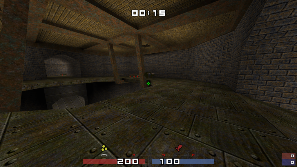
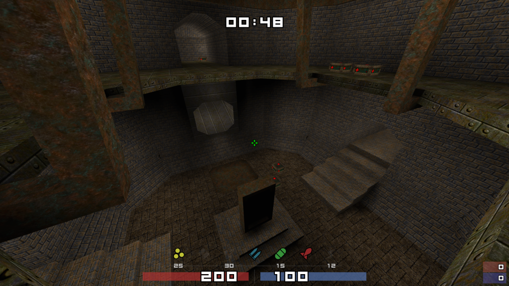
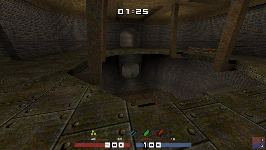
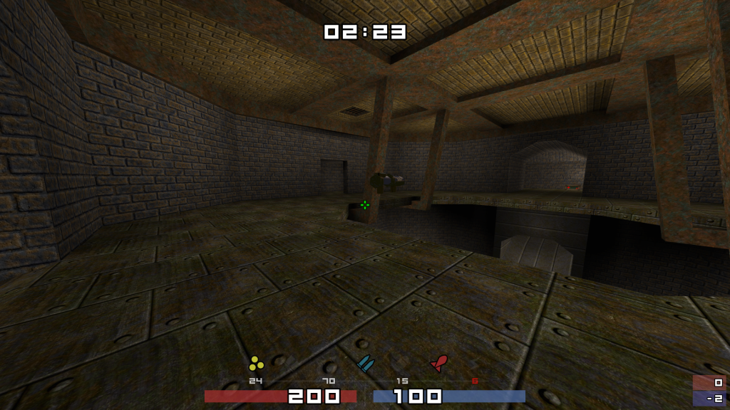
Been using this hud for awhile now and only have one real problem with it.. and or suggestion??? im not going back thew all 6 pages to see if this was discussed im lazy im american what do you want.. basically my problem is that the ammo for rockets and gl only show up under the gl and not the rl.. the quick look at the icons tell me I have the icon lit up for me in "my own brain way of thinkig" lit up means I have ammo for this weapon.... not paying much attention to the gl icon and the numbers under it.. is their a command to add numbers under the rl as well.. im going to include some pictures of ammo with gl and rl and rl without gl and so on and so forth.. My ida now,,,,,,, dont know if this can be done but usually you know when you have picked up a item ie: gl/rl is their a way to make the rl and gl icon over lap one another with the ammo underneath and when you switch it shows the rl icon with the numbers underneath then when you switch you see the numbers underneath the gl icon.. or is this impossible??? im going to add some pictures to show ya what im seeing...
Member
186 posts
Registered:
Jan 2008
First question no, there are only 5 hud entities for ammo:
hud_ammo_* (active ammo)
hud_ammo1_* (shells)
hud_ammo2_* (nails)
hud_ammo3_* (rockets/grenades)
hud_ammo4_* (cells)
and you can't duplicate any of those, if that was possible it would be no problem.
The second is possible with a bit of scripting.
But it wouldn't work perfect because the only trigger that is allowed with ruleset smackdown is f_weaponchange,
to make it work flawless you would need f_took ... maybe even f_respawn.
Member
805 posts
Registered:
Mar 2006
you can make a pile with the rocket and grenade icons, don't think this's gonna look great, or you can place the grenade counter, a litle bit to the right, and maybe add some graphic to show it applies to both weapons. oh yeah, and you can also hypnotise yourself to don't bother with this, since your hud is one of the bests!  https://tinyurl.com/qwbrasil - QuakeFiles
Member
343 posts
Registered:
Feb 2006
Is there a matching r_tracker icon pack somewhere? Would be nice  ProjectQ1Q3, Frogbot Waypoint and Map Conversion Tutorial @ http://mickkn.mooo.com
Member
186 posts
Registered:
Jan 2008
Never made a full set since it like 8x8 pixels or something. Did try it but i didn�t like the look.
Member
4 posts
Registered:
Feb 2014
im having this prob with your cfg how can i fix it?

|
 |
 |
|


