 |
 |
|
|

Member
226 posts
Registered:
Jun 2006
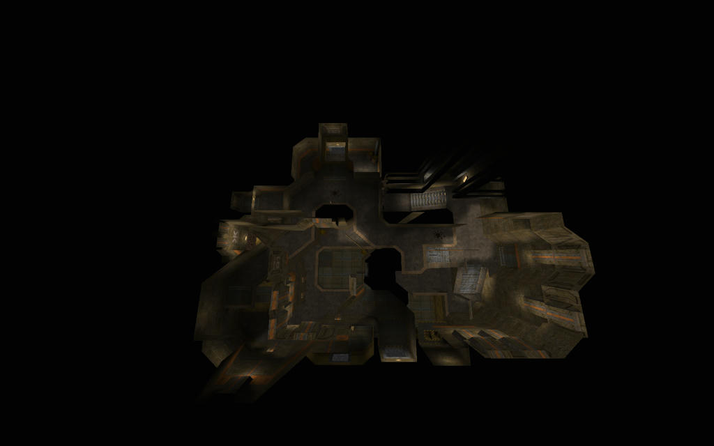
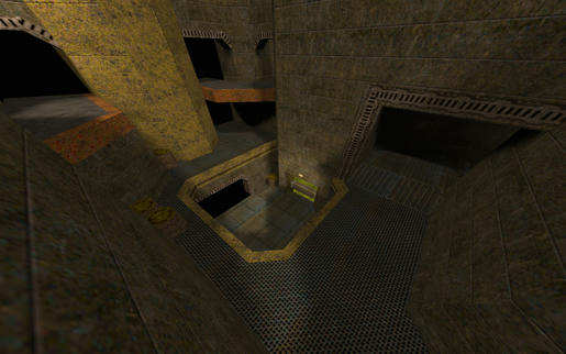
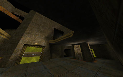
Exile - Beta 1 (r6)birds eye layout Description: This is an BETA version of a duel / 2on2 tournament style map that I've been playing with. It is extremely vertical and follows a texuring/detailing theme borrowed from the Quake4 map Phrantic by swelt. Texturing and detailing is near completion. On the map you can currently find two RLs, one GL, the LG as well as a Mega Health, one RA, and one YA. Download: ====Current Build The zip with readme and bsp: - Beta 1r6: exileb1r6.zip - Mediafire (703KB)Just the bsp: Beta 1r6 exileb1r6.bsp - box.com (708KB)====Older Builds - Alpha 6r3: exilea6r3.zip - Mediafire (702.46KB)- Alpha 2r1: exilea2r1.bsp - Mediafire (249 KB)Feedback: - Item placement - geometry - connectivity - layout - Lighting - Textures - detailing - Im open to different ideas for teleport locations Every comment and suggestion will be looked at and considered. Enjoy and have fun! (Edited 2013-03-14, 21:16)
Member
286 posts
Registered:
Sep 2012
Marry me. I just ran a bit around it and i have a few suggestions: - I love the double rampjump as a shortcut, but I find it really hard to make, maybe you could make a guard to make it easier ( and for some fancyness ). - I think the mega room is useless, and makes the map bigger for no purpose, you could place it somewhere else and get rid of this room ( and the one above ) ? Nothing more for tonight, I also love this shortcut !
Member
223 posts
Registered:
Aug 2011
It�s pitch black, what am I missing? carrier has arrived - twitch.tv/carapace_
Member
286 posts
Registered:
Sep 2012
Maybe try with gl_loadlitfiles 0 cara.
Member
223 posts
Registered:
Aug 2011
It says it�s not a supported map. carrier has arrived - twitch.tv/carapace_
Member
459 posts
Registered:
Mar 2008
Marry me. I just ran a bit around it and i have a few suggestions: - I love the double rampjump as a shortcut, but I find it really hard to make, maybe you could make a guard to make it easier ( and for some fancyness ). - I think the mega room is useless, and makes the map bigger for no purpose, you could place it somewhere else and get rid of this room ( and the one above ) ? Nothing more for tonight, I also love this shortcut ! The double ramp is quite easy if you wallhug
Member
286 posts
Registered:
Sep 2012
Member
459 posts
Registered:
Mar 2008
I won't hug anybody ! OK. French kiss the wall and it is quite easy.
Member
286 posts
Registered:
Sep 2012
Member
73 posts
Registered:
Feb 2008
My 2 cents! The doubleslopejump is a tad to difficult. The teleporter brushes extends outside the wall, move them in. The sloped way out from the RA room, move the slope abit more out from the room so u can do a sloped RJ out from the room up to topfloor in the next room. The bottomstairs in the YA room, add a trim or a rail to the left on the stairs so u can do a slopejump in order to get to the top of the next stairs. The MH room is a bit dull, lower the floor a bit so u can�t do a RJ up to the room above without using the slope (maybe addsome water in there) I would like to see a new path between the "main-room" and the RA room, ideally it would start in the corner over the regular bottom-entrance to the room and end up over the water-exit in the RA room, it would be as high as the topfloor in the RA-room. (hard to explain without using pictures)  If u jump down from topfloor in the RA room u can utilize the slope at the water-exit to go really fast over the water while grabbing the LG, reward this by making it so u dont make a watersplash-sound while grabbing the LG by putting the LG on a platform. make the hole down to MH bigger so u can�t get stuck on the edges in the floor. I also love the shortcut Jisse mentioned. Just realized I used words as "make" or "do", all of the above is purely suggestions, im not commanding you to do anything 
Member
94 posts
Registered:
Oct 2011
Have jumped around the map, and I really like it, you can get real nice speed on it.
Me to have trouble with the double ramp jump, like Jissse said a rail or something maybe would be helpfull.
Also I think he right about the MH room, it could be removed or made smaller perhaps, I think the mega could be on top of the map cause I feel it looks empty up there.
Other then that I really like the map, and can't wait for it to get up on some server and try some 2on2 on it! Good job!
Member
73 posts
Registered:
Feb 2008
What program are u using, gtkradiant?
Member
53 posts
Registered:
Feb 2008
nice map 
Member
73 posts
Registered:
Feb 2008
Any progress? 
Member
18 posts
Registered:
Nov 2008
This map is looking great! I'll return with some feedback once I have a chance to run through it more.
Member
60 posts
Registered:
Nov 2010
I like it so far. Hope to see further development. In the mean time here is two more tricks.
Member
73 posts
Registered:
Feb 2008
What the?! lifts give you thrust upwards? I did not know that...
Member
60 posts
Registered:
Nov 2010
They don't. QW has double jumps which is what it was, but since time window is very tiny (that's why you can't even hear it's dj in demo) they're quite useless.
Member
73 posts
Registered:
Feb 2008
do u have to come at it at an angle for it to work?
Member
226 posts
Registered:
Jun 2006
Yep still working on it. Got some really good feedback from JAMAL on some stuff that didnt feel right so I needed to gestate for a couple of weeks by mocking up totally different layouts to take my mind off the problems he pointed out. Came back to it yesterday and found some solutions to make the layout more interesting so stay tuned.
Member
226 posts
Registered:
Jun 2006
I have the layout / connectivity finalized. Working on rebuilding the map from scratch using non-developer textures now. Starting on the most important part of the map, the main atrium! Haven't really put much thought into detailing it or lighting it yet but just wanted to give people something to chew on and to assure them that I'm still working on this map.
Administrator
2059 posts
Registered:
Jan 2006
I seem to get no textures at all on this map. I downloaded the map using the link in the first post of this thread. I can load the map but all textures are like one big white grid on a yellowish background, just like all textures are missing. I use nQuake + pak1.pak. Am i doing something wrong? www.facebook.com/QuakeWorld
Member
60 posts
Registered:
Nov 2010
Those are what he means by 'development textures'. You can't miss textures in a map, the bsp file itself contains them.
Member
226 posts
Registered:
Jun 2006
Bumped the original post with a link to the latest version Alpha6r3. Thanks for all the feedback guys. This version is quite a bit different than the previous one but a lot of the concepts are still the same.
Administrator
891 posts
Registered:
Jan 2006
I think mr.pangela is on the move to upload it to his servers (pangela.se) - if you want that? Join us on discord.quake.world
Member
226 posts
Registered:
Jun 2006
Have a cleaner update today that gets rid of the confusing teleporter layout. Hopefully he didn't already upload it. I'll update the original post with it within the hour. It's still in beta and hopefully I will only have 1 more beta release before the final. Things could change though.
Beta 1 R6 (03/14/13)
- Added new megahealth platform near the RA drop tube
- Added windtunnel to YA instead of it just being a dead end
- Removed GL tele
- Moved top cells spawn to where old GL-Tele exit was
- Raised old megahealth cove up one level
- Teleporter layout has changed, only 3 teles total now
- Small detail changes near quad / YA / top-ra to GL path (pipes)
- Bottom cells moved right next to LG instead of in front of LG
link to newest version in first post.
(Edited 2013-03-14, 17:50)
Member
286 posts
Registered:
Sep 2012
So basically you took everything we liked and removed it form your map ? 
Member
226 posts
Registered:
Jun 2006
So basically you took everything we liked and removed it form your map ?  you bet
Member
60 posts
Registered:
Nov 2010
Newest archive contains new .txt but previous .bsp
Member
226 posts
Registered:
Jun 2006
Newest archive contains new .txt but previous .bsp shit, my bad, fixed

|
 |
 |
|


