 |
 |
|
|

Member
14 posts
Registered:
Feb 2014
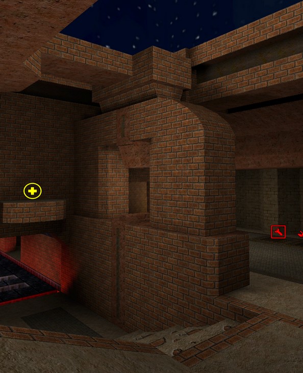
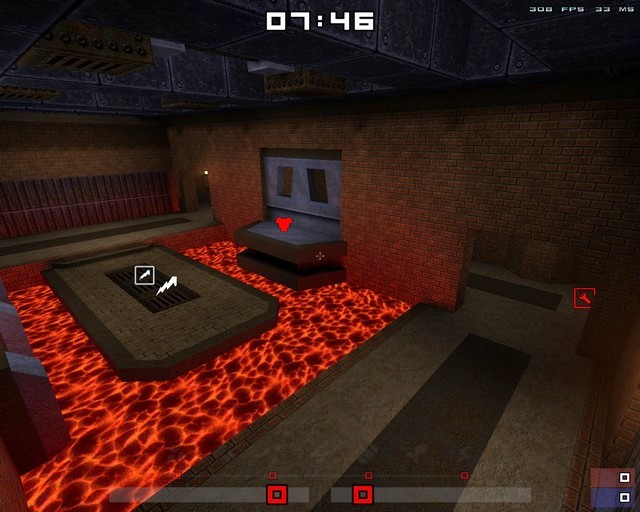
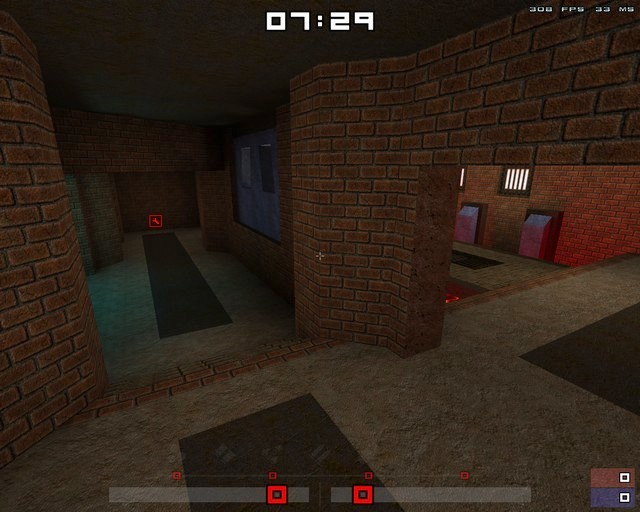
I've been working on this map for about a week now, it's still unfinished but I'd really like to get some feedback on how it plays. It's a very small map designed for a fast paced 1on1. I'll be adding more detail (structure, lighting, etc..) once I know the layout is solid. I'm still unsure about some of the item placements, specifically the quad and health pick-ups, so any feedback on that would be good, and also any feedback on the layout, structure, weapons, ammo, etc.. would be great also. Weapons: 2 x RL, 1 x GL, 1 x LG and 1 x SNG Power-ups: 1 x QUAD, 1 x MH Armour: 1 x RA, 1 x YA, 1 x GA Ammo: Plenty... (maybe too much). Health: 8 x SML, 1 x LRG... (maybe too much also). It will be my first release once it's complete, let me know what you think. Oh and  Spirit, I'll definitely write a readme for the final release, glad I'm not the only one. =) Download links: rk_b1.bsprk_b1.lit(Edited 2014-02-11, 04:45)
Member
55 posts
Registered:
Oct 2011
I'm adding this to our servers, so that people could help you more for reviewing in normal plays! BaseQ.fr Administrator o/
Member
14 posts
Registered:
Feb 2014
Member
14 posts
Registered:
Feb 2014
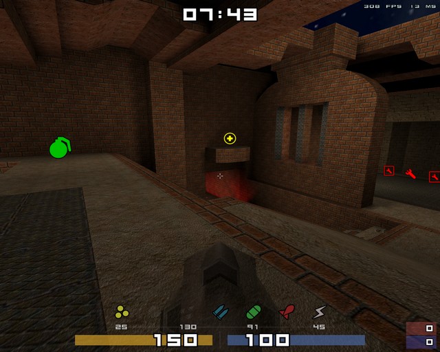
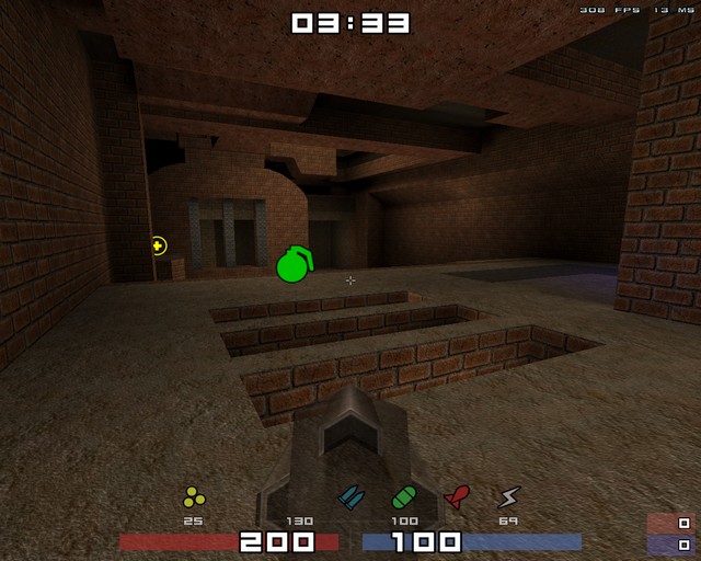
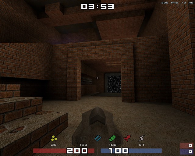
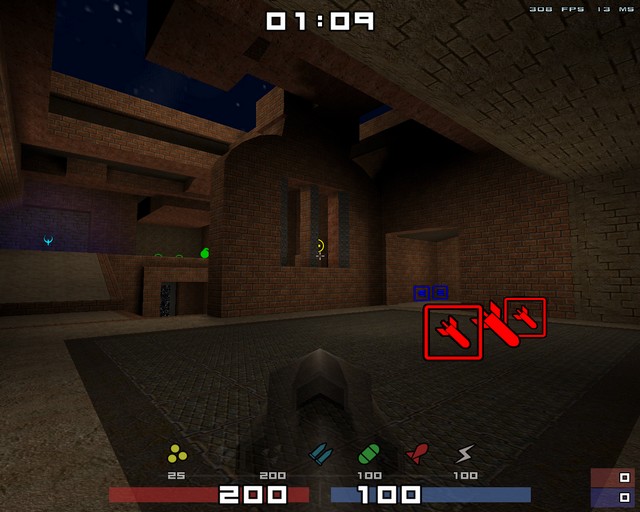
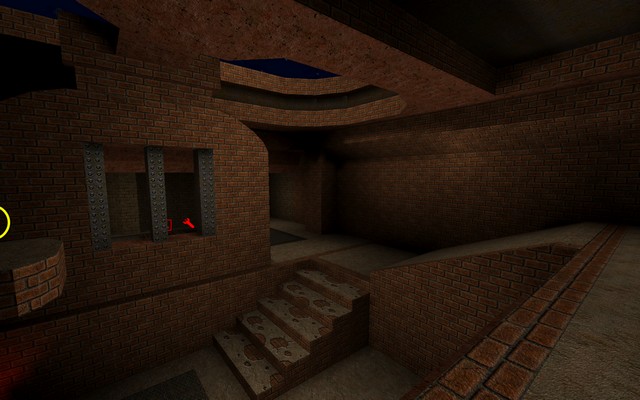
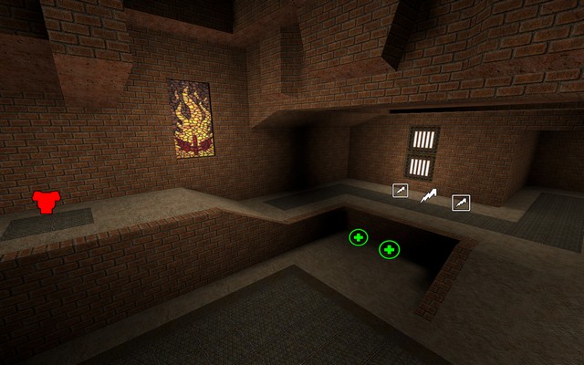
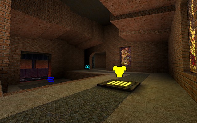
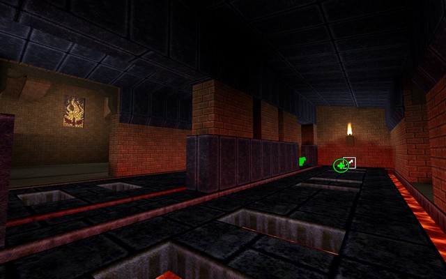
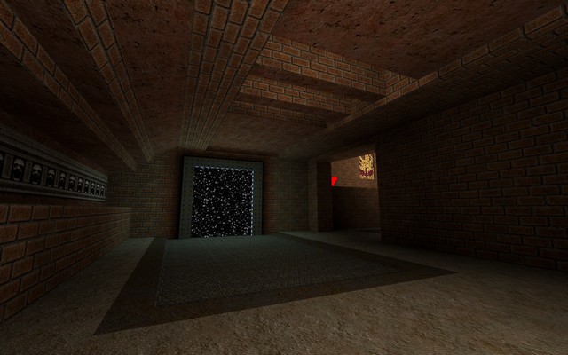
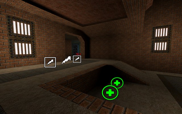
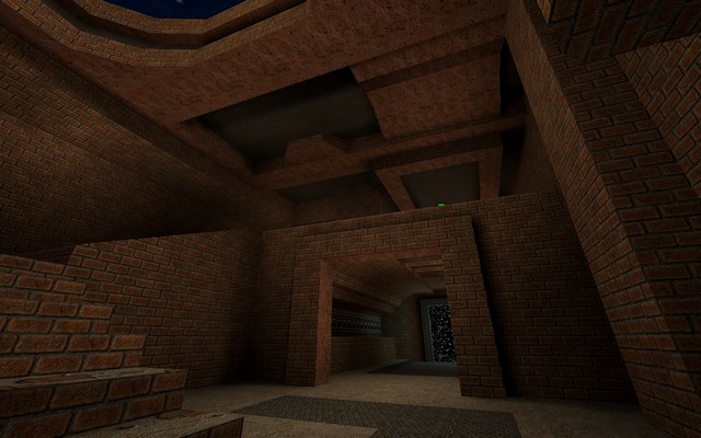
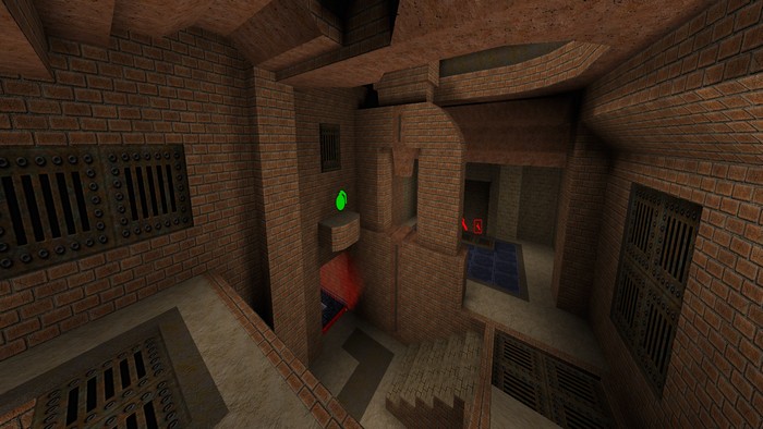
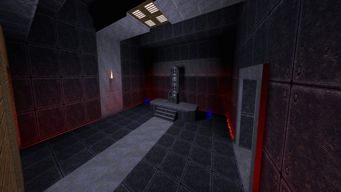
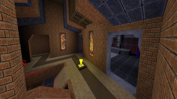
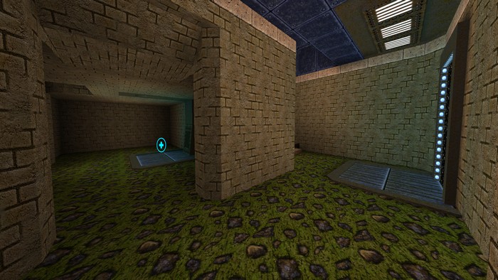
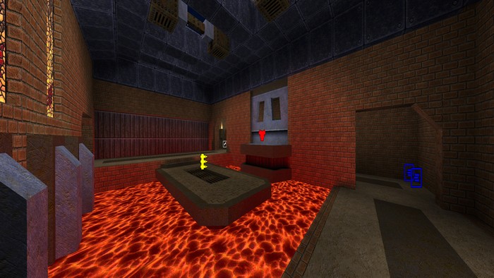
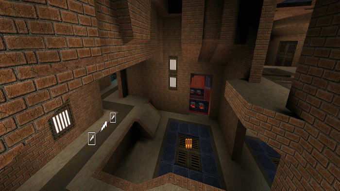
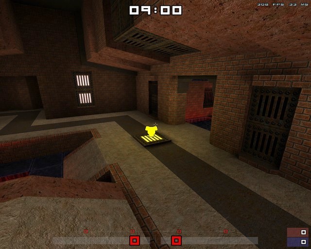
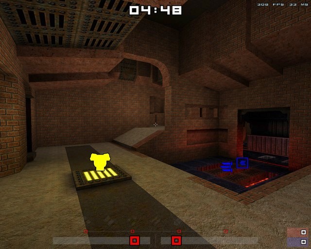
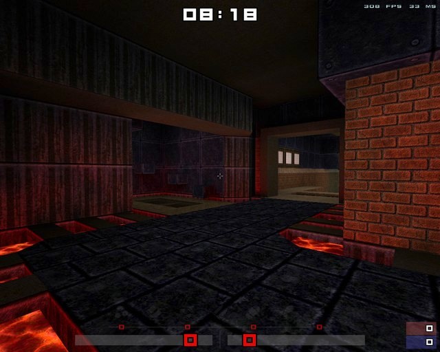
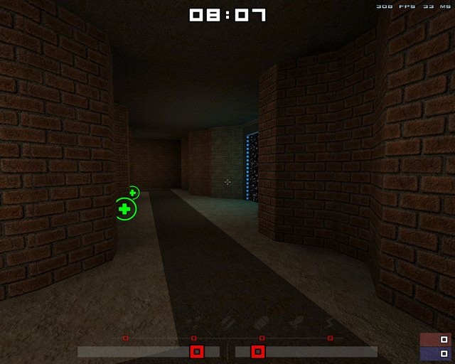
I've added a bit more detail, lighting, etc.. here's some screenshots. I've removed the QUAD from rk.bsp, and included rk_quad.bsp for people to compare the two. Also, if any admins feel like uploading this to their servers so that I can get some feedback, I would really appreciate it a lot. =) Download latest version: rk.zip
Member
73 posts
Registered:
Oct 2010
Wow! First notthrowyoureyeawayable colored lighting i've ever seen/!!!!
I see very good "e1m5-style" proto-map! As for me that element with barred window seems like simulation - too flat for Quake.
Wish the author to finish it carefully - I think it can develop in a map as good as ztndm6.. even better.
//will take a look at the latest version now..
Member
1102 posts
Registered:
Jan 2006
mega is a pain in the ass for server admins as you need a browser with fancy blingbling to download. Use quaketastic. 
Member
14 posts
Registered:
Feb 2014
Thanks VanoZ, I've started looking at ways to make that element look a little less simulated, as you put it. I'll have a new version up soon. In the mean time, I've uploaded the current version to Quaketastic to make it easier for any server admins out there. Thanks for the suggestion  Spirit. Download: rk_b2.zip
Member
55 posts
Registered:
Oct 2011
I updated the servers to include rk.bsp & rk_quad.bsp .
EDIT: And replaced it to the maps from the rk_b2 archive.
I really like the design of the map, despite I find I find it a little small, and looks like more adapted for FFA or 2o2 rather than 1o1...
I'll have to try some duels before being able to give a better criticism of the map anyway!
Keep up the good work! BaseQ.fr Administrator o/
News Writer
34 posts
Registered:
Dec 2011
Looking good architecture wise  but you should consider making the map larger and also rework the item placement. Ra, Lg, Rl, Ya, MEga too close. Also the health box over the doorway? or arch/opening into ga room, Maybe put mega or ra there instead. Maybe Reduce the amount of items on the map also Great work tho.
Member
14 posts
Registered:
Feb 2014
Thanks once again  Ch0wW. And VanoZ, as I mentioned before, I'm working on improving that element, here's a screenshot of what I have so far. Also, thanks for the feedback Muff1ns, I've got some ideas about making the map a little bigger, I'll post an update soon. =)
Administrator
891 posts
Registered:
Jan 2006
Had some quick jumps around the map last night and found it really nice! Good layout and such. Although:
* The invis ramps annoyed me
* also the invis slope on tele-ledge top (making it impossible to stand on top of that tele)
Will have to check it out more thorough later on. Thumbs up! Join us on discord.quake.world
Member
364 posts
Registered:
Oct 2006
Very, very good looking map. Interesting possibilities for bunny-hops.
What toolchain do you use to compile the map?
Member
14 posts
Registered:
Feb 2014
Thanks Tonik. I'm currently using hmap2 for the bsp and vis builds, and Bengt Light for the (coloured) lighting.
I was aiming for a map that made it nice and fast to move quickly to different areas, especially when using all the speed exploits, so players always have an exit option if needed, in addition opponents can try to chase them down using alternate routes.
=)
Member
14 posts
Registered:
Feb 2014
Alrighty then, here's the latest version (beta 3). The layout is now bigger with a few new areas added and I've moved (or removed) some items. I've also changed some textures and added some grates, tiles, etc... to improve the detail. It will probably handle a 2v2 rather nicely now, give it a try. Screenshots here: As before, I've removed the QUAD from rk.bsp, and included rk_quad.bsp for those inclined. If you find any bugs or have any suggestions / feedback / or even just a general comment let me know. I'll probably release this as a final version once everyone is happy with the item placements. VanoZ, I've removed the bars and made that element look a little less flat, let me know what you think. Muff1ns, I've got the GL over that doorway now. Try it out and let me know.  bps, I've removed most of the invisible ramps (there's still one near the YA, so players don't get stuck, but it shouldn't be too noticeable). Download: rk_b3.zipI've added this to quaketastic for any server admins who might kindly want to upload this to their servers. =)
News Writer
34 posts
Registered:
Dec 2011
Ok i ran around on the map and this is hat i feel needs to be changed: Keep your level texturing to a theme, the reddish with some other textures like the blue or the yellowish brick to break the other one off just a little. Now its a little bit too much. One example is the throne room wich is all blue and the rest is red and the mega is only yellow. Try with red texturing througout the whole map then add some other texturing in minor places like yellow or blue. Ammo is another issue and weapon placement. I would remove the RL wich is next to LG, because that is the 2 best weapons in the game. Also i would remove ammo boxes from LG and RL so its only one ammo box at each weapon. Also you have only placed BIG ammo boxes of lg and rl ammo. switch those to small. maybe keep one big rl and lg on the entire map and let the rest be small boxes. Room Space: The throne room doesnt really fit in as it is right now. Its way too big, try making it smaller and try to feel if it fits in the map if not remove and make something else there, maybe just make a small room and move YA there. The MEGA room is good and also the tele area, except the space the mega is in. its too big. try pushing the wall opposite from where you come into the room so the wall is closer to the airlift. Also the new red armor area is way too big if you compare it to the original level. try shrinking it and also the corridor with the tele. its too wide and too high in ceiling. Other than that good job!. one tip is to use the red brick with the red ceiling texture at gl, looks really good, throughout the whole level.
Member
14 posts
Registered:
Feb 2014
Thanks for the detailed feedback Muff1ns, have you played any matches on the map yet, keen to get some opinions on how those play out as well.
I'm looking into a few of those things you suggested...
I think I agree with you on the throne room, it doesn't quite fit with me either, I may have rushed it in an effort to upload the latest version, but it's better to do these things properly. I think I may just turn it into a small hallway with some lava lighting similar in style to the middle of the map to keep with that style of red brick, with a dash of metal for the lava areas, etc. I'll play around with the textures near the MH area, and some other areas also.
The ammo next to the RL (near GL and MH) I think were small, but I believe I did actually make the others BIG, I'll drop those to small and maybe limit the ammo as you suggested, that should also make the map a little more challenging and more tactical.
I'm testing the map with a reduced MH area, but I'm not quite sold yet on making the other hallways and the RA area smaller. I've got some ideas about reducing the RA area, but I quite like the size it is now, and the hallways too. What are the reasons you think these should be smaller, I'd probably be more convinced if I knew what your thoughts were on these in a bit more detail.
Also, I've added you in the credits (rk.txt) when the map is finally finished, for your input into the design. =)
News Writer
34 posts
Registered:
Dec 2011
Well my short answer is that the wide and high corridors feel big for 1on1 , better suited for ffa =). you wont get much (if any) splash damage from rockets and easier to avoid grenades. I usually go for 4 players wide corridors, and that is even too wide sometimes. If you have a look at the original dm maps for quake they are sometimes 2 or 3 players wide. Also the red armor area, its almost pointless to use anything else besides shotgun or lg, as its so large its hard to hit a player with the rocket launcher. You have to aim for the walls or floors. One thing that is good to have in mind is that if one player is up high and the other player is down below, the roof up high should often be so low that it will give splash damage to the player to some degree and also it should be based on how the area looks. you can't always have low ceiling on high places but its a good thing to keep in mind the splash damage from rocket launcher.
Player wide example is that in the editor you have a box for the player. thats what i use to measure every corridor in the map. In the rooms i just use my gut feeling of what feels good and alot of playtesting by myself just shooting rockets, grenades etc.
Thanks for the credit ;D just trying to help.
Member
14 posts
Registered:
Feb 2014
I've made various changes, this is BETA 4. Changes: - RA room is now smaller, and LG has been been moved here also (comments.. good/bad?) - Passage ways now have some extra structures to reduce width, and in some cases height. - Quad area is completely revised, much smaller and the QUAD is harder to get too. - Texture changes and items added/removed in various places. Muff1ns let me know what you think. I've met you halfway on some of your suggestions, fire it up and let me know if those passage ways are small enough, as I could probably make them a little smaller if needed. Screenshots here: As before, I've removed the QUAD from rk.bsp, and included rk_quad.bsp for those inclined. Download: rk_b4.zipIf you find any bugs or have any suggestions / feedback / or even just a general comment let me know.
Member
805 posts
Registered:
Mar 2006
Looks amazing, I'll try it later! https://tinyurl.com/qwbrasil - QuakeFiles
Member
73 posts
Registered:
Oct 2010
tested, got some good frags on it ) https://vimeo.com/88772728
Member
14 posts
Registered:
Feb 2014
Nice frag. Glad to see your making good use of that element now. =)
Member
73 posts
Registered:
Oct 2010
Map is good and getting better. May be you should stop listening to suggestions and make what you think is right)
As for me - nearly all maps played for years has not very complex, but true 3d structure, up to now rk looks flat like doom map for me.
Don't really mind, i'll play it sometimes anyway ;-)
News Writer
34 posts
Registered:
Dec 2011
OK so i checked it out. But i will comment on Vanoz first. 1st is that suggestions and feedback on your work is the best peice of information you can get to evolve and become better at what you do. Never forget this. I have worked for a very limited period of time on a gaming company and everything you do is based on feedback. You itterate maps like crazy. Hell sometimes you even have to scrap whole sections of the map and do something else. Sometimes you even have to scrap the whole map. Feedback and suggestions is key. 2nd You yourself vanoz give a suggestion or feedback that the map is too flat. I can agree partly on this. One thing how to overcome this is to lower the lava levels quite a bit. example, At sng, ra, ssg and also the blue floored walkway in the center of the map. Test this out, you might be suprised at the result  3rd you say the map is getting better, well its based of feedback and suggestions. Ok so now im done with that. You have to think about what you want with your map. In your first post you said it was fast paced. But the map was too tiny and too fast paced =) so you made it bigger. But you kept the wideness of your corridors. So now the map is too big and feels like and ffa map. I said it before and i think you should fix your corridors and make em smaller. just save the map in another name on your hard-drive then test it out. cause now the map is good in size but corridors is too wide. So shrink them and you will get a fast paced 1on1 map that is not too tiny and not too large. Also splash damage is important! =). Also. where the throne room where thats where quad is upp the stair thingy ? i suggest you remove it because it doesnt fit in at all. (maybe skip quad, you dont need it in a 1on1 map) Keep up the good work!
Administrator
1266 posts
Registered:
Jan 2006
my 2 cents:
ammo amount and placing is crucial to any map.
cap either rockets or cells (my vote is to cap cells) to make it much more interesting and less +fwd, so every shot is calculated. enough spam fests like in ztn or aero. never argue with an idiot. they'll bring you back to their level and then beat you with experience.
Member
231 posts
Registered:
Jan 2006
Map is fantastic, still think more details and consistent theme will help for sure!
Keep the good work!
Member
14 posts
Registered:
Feb 2014
Thanks for all the feedback everyone, keep it coming.
I'm currently looking at reducing the flatness as mentioned by both VanoZ and Muff1ns. So far I've taken Muff1ns suggestion and dropped the middle section, it's looking good but needs a bit more work, and maybe another teleporter. I'm planning to drop the RA bridge and platform to see what that looks like, and possibly add a small area near the ceiling there. I'll post another update when I'm happy with it to get some more feedback.
Muff1ns, I've got a plan to make those corridors smaller again, and I'll probably remove the quad. I'm still aiming for a fast paced 1v1, with possibly the option of a 2v2 also, in any case I'm starting to agree that those corridors need to be smaller. I think once I've dropped the lava areas (great idea btw, I was considering building up, not down) I might even fill in some of the other areas to make them smaller as well.
Also, can someone delete the files rk_b2.zip and rk_b3.zip from Quaketastic, would it be better if I create an rk folder while I'm uploading each revision?
=)
Member
156 posts
Registered:
Mar 2007
Was there ever a final version of this map? I was going to create some Frikbot waypoints for it, but didn't want to if it's not done. 
Member
14 posts
Registered:
Feb 2014
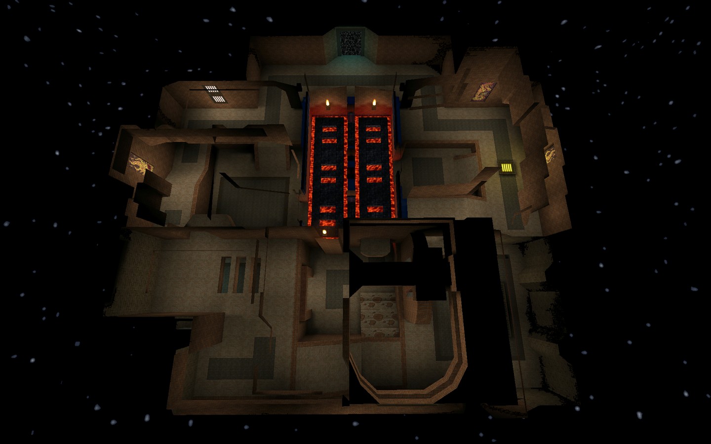
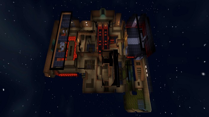
So 3 years later... I've made some updates, and decided this map is probably a bit too large for 1v1 now, but should be good for some FFA. I might make a smaller map in this theme specifically for 1v1. If people wanna play test this for a while I can update the weapon / item placements based on any suggestions. =) Updates: - Reduced ammo - Added roof area + air lift - Moved MH rk.zip

|
 |
 |
|
 Spirit, I'll definitely write a readme for the final release, glad I'm not the only one. =)
 Spirit, I'll definitely write a readme for the final release, glad I'm not the only one. =)


