 |
 |
|
|

Member
11 posts
Registered:
Jul 2008
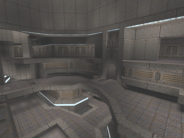
Hello have spent alot of time at my friends house building a new map when i have been bored will soon put up the .bsp file hope you like the pictures! (always hard to find matching textures  ). /Johan !!UPDATE!! Ive started a server so you guys could test it out and plz give alot of feedback and ideas to improve the map (first beta test, only played a couple of games against an irl friend it worked out kinda ok, though teleport destinations isnt very good atm) 82.99.106.60:28001 to test it out! over and out! /Johan When love and death embrace
Member
1102 posts
Registered:
Jan 2006
Nice looks, I really like the texturing!
Don't like the small block lights (as in front on the second shot) though, I'd just remove those.
Instead of rotating the wall texture (above the bridge on shot 1) maybe try a different one?
Member
1435 posts
Registered:
Jan 2006
The sshots show the map has some spirit (oh hi there..)! I like that 
Administrator
2059 posts
Registered:
Jan 2006
Looks promising indeed. Nice architecture and nice texturing = gg so far. We'll see what the layout and item placement is like though.  Keep up the good work! www.facebook.com/QuakeWorld
Member
50 posts
Registered:
Jul 2009
that looks awesome, cant wait for release 
Administrator
887 posts
Registered:
Jan 2006
looks very interesting, now bjud bsp Join us on discord.quake.world
Member
11 posts
Registered:
Jul 2008
!!UPDATE!! Ive started a server so you guys could test it out and plz give alot of feedback and ideas to improve the map (first beta test, only played a couple of games against an irl friend it worked out kinda ok, though teleport destinations isnt very good atm)
82.99.106.60:28001 to test it out! over and out! /Johan When love and death embrace
Member
357 posts
Registered:
Nov 2008
Where are the shells and nails? "the quieter you become, the more you are able to hear"
Member
11 posts
Registered:
Jul 2008
They are incoming  , dont even think its an sng/ng yet When love and death embrace
Member
174 posts
Registered:
Nov 2006
I see one thing thas is very common in custom maps and usually makes it fail quite early = Not enough height in the rooms, between the floor and the roof etc, which makes it lots too easy to a) hit b) prewarish etc. So the same layout but growing it a bit could help? (Notice, haven't really tried the map, just something spotted fast from the pics)
Member
705 posts
Registered:
Feb 2006
you might want to add a few holes in the lg-bridge, dm4style
Member
11 posts
Registered:
Jul 2008
Ok ill see what i can do about roofheight! thx for the idea and holes at bridge, i will try it out! When love and death embrace
Member
705 posts
Registered:
Feb 2006
anyone who has admin on the kenya collective? i'd be willing to setup a tour this weekend.
Administrator
887 posts
Registered:
Jan 2006
Join us on discord.quake.world
Member
73 posts
Registered:
Jul 2008
i really wish preacher had finished his waterwalk map, i saw some screens a while ago and it looked amazing
Member
793 posts
Registered:
Feb 2006
anyone who has admin on the kenya collective? i'd be willing to setup a tour this weekend. i'd play. hit me up on irc if you need admins.
Member
705 posts
Registered:
Feb 2006
eksy remember to keep it on topic =)
News Writer
169 posts
Registered:
Dec 2007
Was going to test the map but the server was down, possible that you could put it up as a download somewhere like rapidshare?
Member
705 posts
Registered:
Feb 2006
tourney is on hold untill sagge says it's ok :p
Member
28 posts
Registered:
Feb 2008
Yeah, way too tight.. today qw is even faster and you need some big rooms to fight it out. Just look at all the popular maps.. dm2, dm4, dm6 and aero all got big spaces. Players don't want to get stuck, hit walls and ceilings and want their aim to matter, not just splash damage from an always near wall.
I don't like the textures either. Too dark and monotonous. Now that we have support for high color textures, use them.
Sorry if I'm too critical, hope it's constructive at least. http://www.myspace.com/cervello
Member
1102 posts
Registered:
Jan 2006
Yes, needs more colours! http://www.quaketastic.com/upload/files/screen_shots/zomgqw1.jpg http://www.quaketastic.com/upload/files/screen_shots/zomgqw2.jpg http://www.quaketastic.com/upload/files/screen_shots/zomgqw3.jpg Sorry, I felt silly.  I love the textures.
News Writer
1267 posts
Registered:
Jun 2007
what spirit posted feels like a new version of what happens when you go "gl_nobind 0" in some older version of glqwcl.exe 
Administrator
887 posts
Registered:
Jan 2006
Join us on discord.quake.world

|
 |
 |
|
 ).
).


